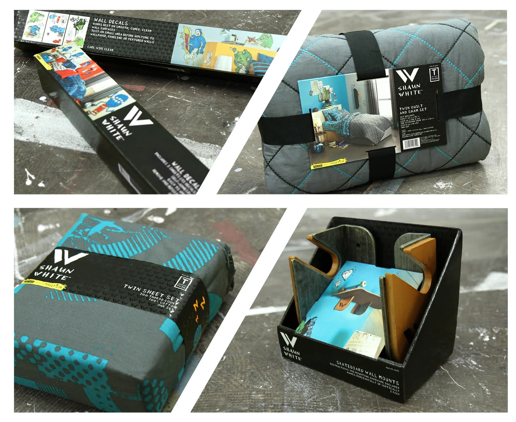
Yes, that Shaun White. He had a clothing line at Target for men and boys that eventually expanded into hardlines, home decor and such.
Target had strict rules for basics packaging, and this is where I got to break them. This was a designer brand. The packaging needed to stand out, so the existing size, quantity, and product icon lockups that were historically the same across all owned brands would just not do. This was a street art-inspired brand that needed street art-inspired illustrations. So that's what I made, along with concepting that the Blue Monster (which Shaun's brother created) would pop off the top and hold them, as the solve for including him somewhere on the PDP. This also created a design system for vendors to follow when they executed on different-sized dielines, and still look real good. All while satisfying legal packaging requirements. It was a new dawn for softlines packaging... muwahahahahaaa.
I also applied the branding to hardlines packaging formats and created the yellow paint splash graphic element to have "more available at Target.com" stand out and still abide by the many, many requirements for retail packaging.